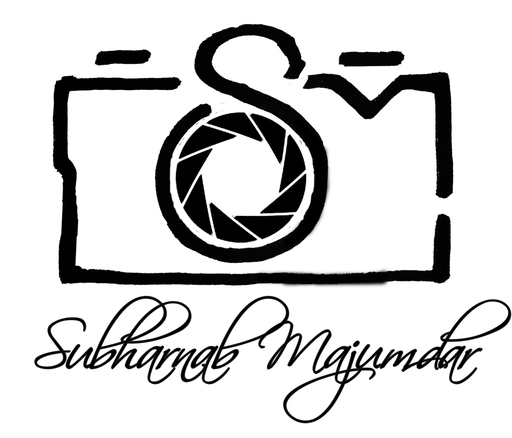
It started with me trying to create a logo for my own photography brand … tried using it in various ways but nothing was working … see for yourself … this was one of those where I tried to somehow combine my initials with a camera …
Nah! ... something always seemed out of place … it was either too much or too little or simply aesthetically inadequate.
So after a lot of failed efforts on the digital platform, I realized I needed something that isn’t tied to one person, something that is bigger, something that is neutral as well as versatile … something that could be associated with a brand that does much more than photography, in case there was ever a need to diversify …. And I realized … I need to sketch it on paper.
But still there is no name, so I kept asking myself the most important question ... "Why?" ... Why photos? What are they good for? Don't get me wrong .... its not our of despair ... it was to get a good answer and enumerate why the pursuit is worth it. Well, the answer I got is ... it freezes moments forever ... for Infinity. So there it was ... the name ... Infinite Moments.
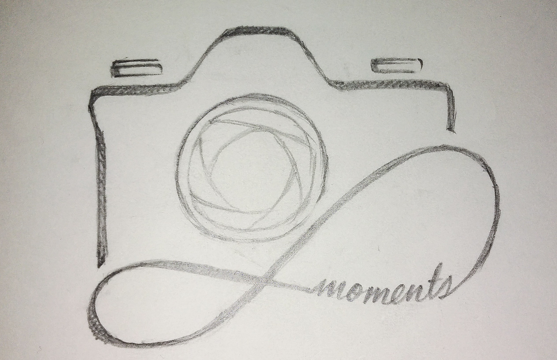
That's when I took out the sketchbook and pencils ... after a little bit of work I had this …
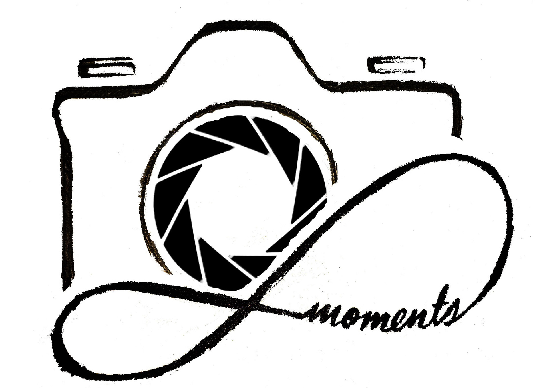
Next step was to scan it and get it ready on digital format. I didn’t like the aperture blades I drew of course … so I added the vector clipart from the earlier trials in its place ... after a little work on the whole thing ... it turned out like this ...
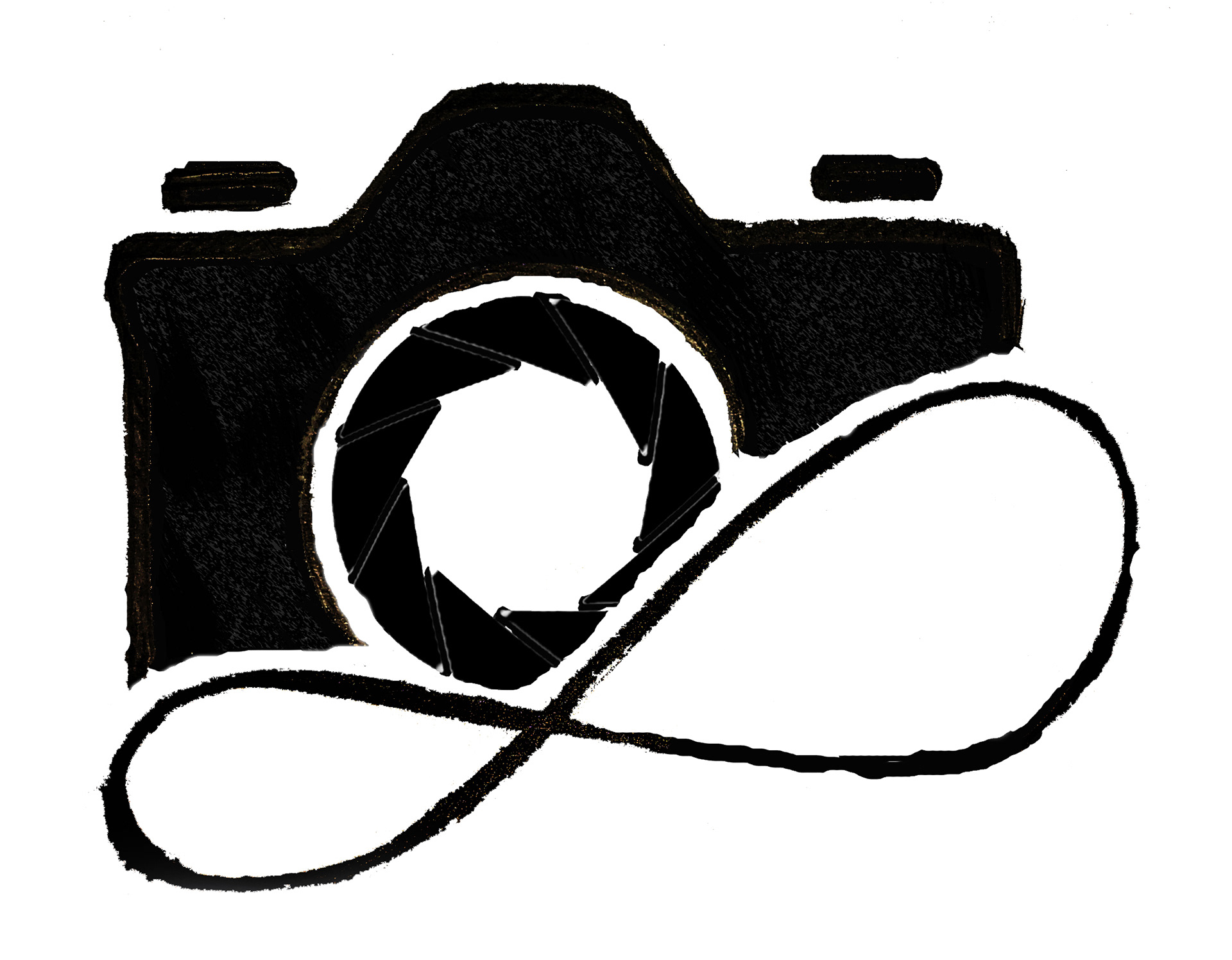
This seemed too empty now ... like a hollow camera ... so tried a few things to fill the gaps.
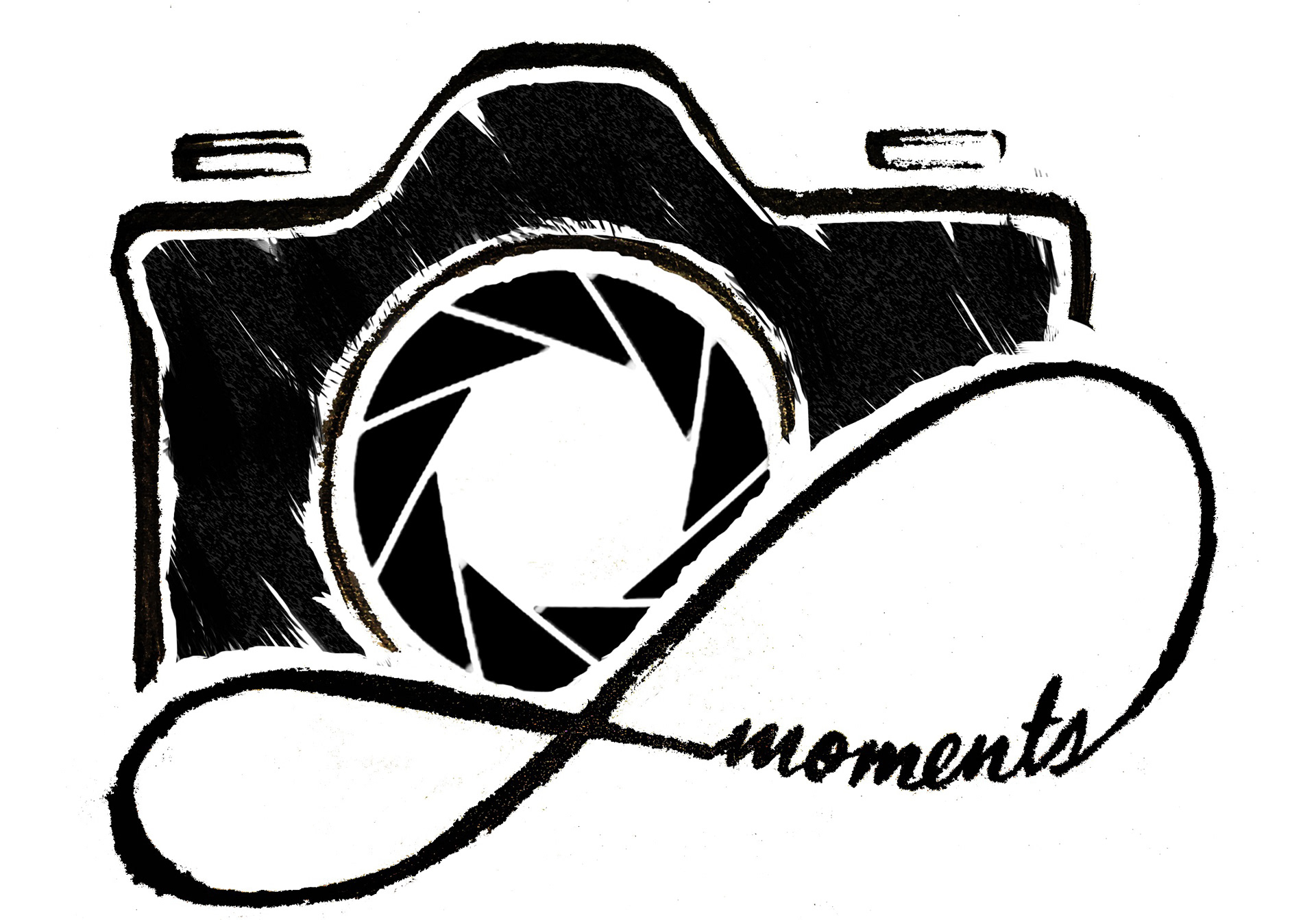
Sheeesh!!! ... this took a real plunge in the wrong direction ... LOL ... so out comes the eraser tool and a many Ctrl + Zs and Ctrl + Ys later ,,, there was this ...
Okay this looked good ... but now it wanted some color ... but what color would be right? Personally I love Black or White or Grey ... but in this case the color had to appeal to everyone, represent our brand and tell our story.
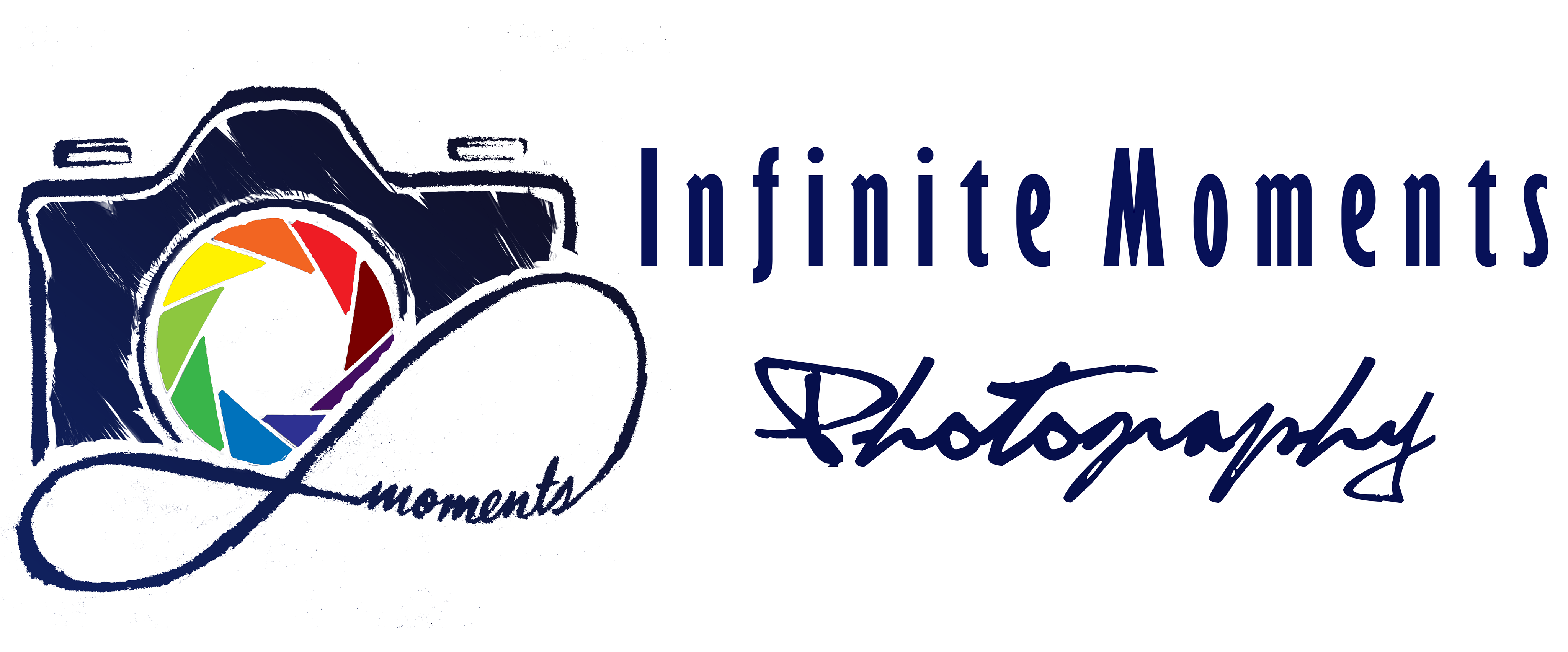
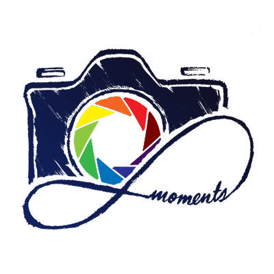
Blue - it represents calm, peace and serenity on one hand and reliability and stability on the other. Blue it is then ... but that wouldn't be enough ... there needs to be a kicker, something that works as a focal point to the whole thing ... how about all the colors? LOL ... anyways after much pondering and back and forth ... here was the final logo.
Love it ... and now for the Infinite Moments name part of the logo ... a little mix of fonts.
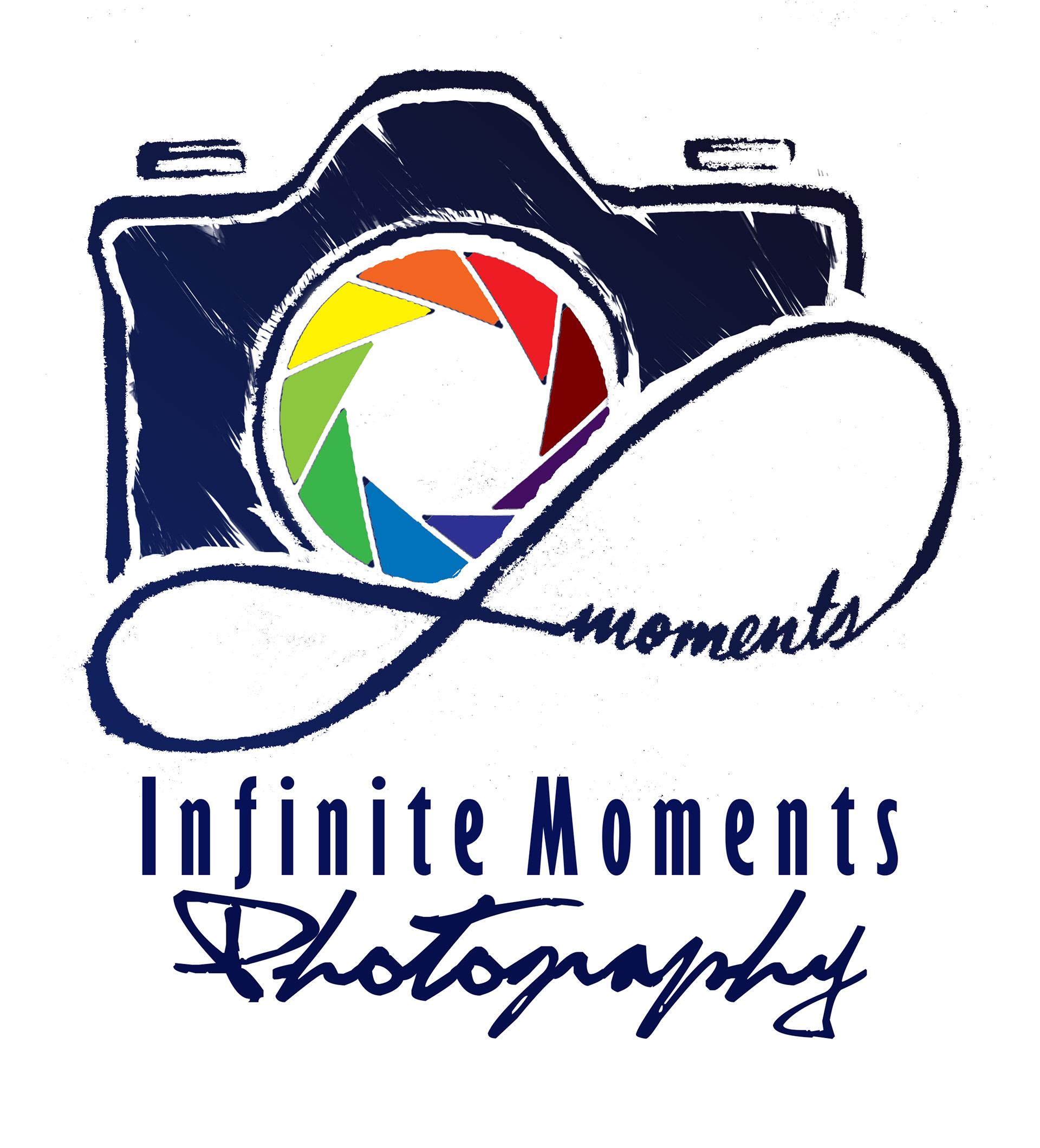
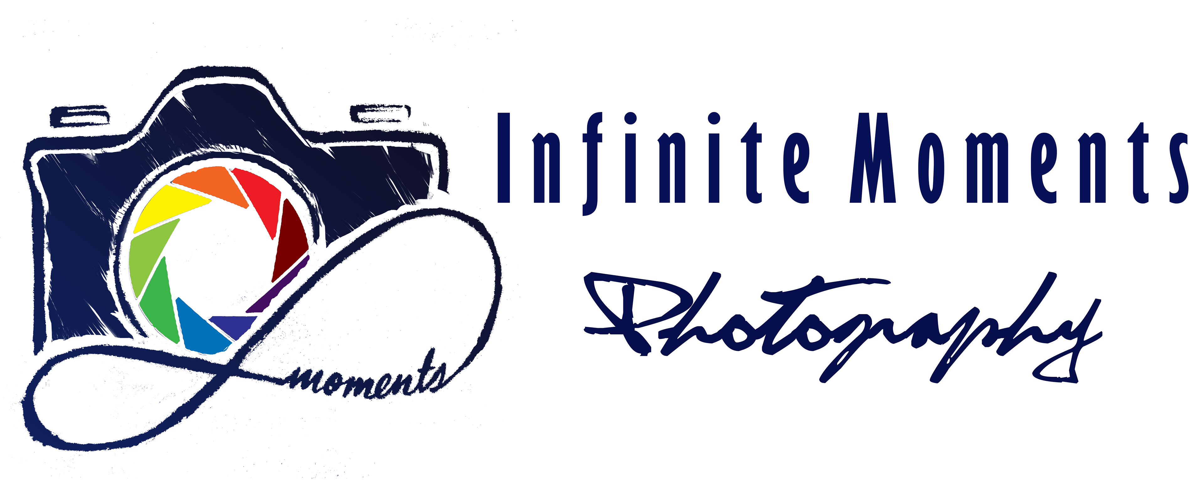
There ... Now its ready!
But then we needed a tagline ... that happened after Vinod joined the vision ... and the tagline "Committing Moments to Eternity" was his idea.